Wednesday 15 December 2010

Action-Thriller Poster


In the first poster I was focusing on the characters actions mainly. I want the audience to focus on the three main characters being the two gang leaders and the undercover cop. The picture is a main scene in our sequence, it's what the story builds up to. So this would be the most interesting part. I think it would drag the audiences attention, which they would ask themselves questions such as "Who is going to win?", "Why are they fighting?" and "What's the undercover cop going to do?". In order to find out they will have to watch it. I was also trying to give a strong sense of an urban area which is what the films background is.

On the second film poster I was focusing on the characters, one of the gangs. I want the audience to get the idea of the gangs and there being a "boss" (Gang leader). Within gangs there is generally a lot of trouble, crime and guns etc. So anyone who is interested in those kind of films would have their attention dragged to the poster.

The third poster was aimed at the diamond itself. This being the centre of the story. As there being a big diamond must be a big story behind it, so this would drag the audiences attention. There is someone holding a gun pointing to the the person with the diamond, also the undercover cop jumping off a roof top towards the man holding the diamond. This gives the audience the idea there is a few people after it.

Friday 10 December 2010

Adulthood Poster Analysis


People
Famous Adam Deacon & Noel Clarke who are in a number of violent films. These are on the front cover which attracts audiences who are interested in previous films they've been starred in or this type of genre. There are a list of famous people who create music, they're the tracks that are featured in this film which may attract many people as lots of people will know their music which relates to this type of film. The way they are dressed are how you would expect typical London gang members to be dressed, so we expect these people to be involved in gangs and crime.

Design
This design is very effective. The people on the front are all sat together which gives us the impression that they're part of a gang, especially that it's based in London. There is a metal baseball bat laying on floor which gives us the sense of strong violence. They're sat on some kind of roof which is outdoors, near the streets where you expect a lot of crime to happen, so we expect these people to be involved in the crime situations.

Colour
The colours in the poster are very interesting, the sky is a type of yellow/orange colour which catches audiences attention and reels them into the film. There is also dark coloured areas which are hinting the dark side of the film.

Title
The title is plain bold black "AdULTHOOD" on top of a yellow/orange sky which makes it very visible to the audience. The title is all capitals except the first "d" in "AdULT" which is mysterious but interesting, which could represent the mysteriousness within the film. It may be representing other features also though.

Other Information
Just above the title "AdULTHOOD" we see it says "After kidulthood comes" so anyone who has previously seen "Kidulthood" would be interested in this film as it's leading on from the "kidulthood".

District B13 Poster Analysis


People
Famous parkourist David Belle is starred in this film, he is on the front of the cover looking as if he is jumping over something. There is also another character holding guns looking up. This gives you the impression they could be working together or against each other which gives you the sense of a big war between these two characters or these two working together against some kind of force which is very appealing to anyone who is interested in action movies or admire David Bell & parkour. There is also a list of all the names of people who have contributed to this movie at the bottom which would drag in audiences who recognize these people's work.

Design
The overall design gives the us (the audience) a strong impression of a type of war going on in a violent city of some kind, we get this impression because of the helicopters and cars behind them as if they're being chased. The graffiti-like wall behind them makes it seem as if it's in a violent city with gangs and such. There are helicopters with lights shining out which gives us the sense these two characters in the middle (David Belle & Cyril Raffaelli) are wanted men.

Colour
Overall the design colours are quite dark, which represents there is bad things going on. The colours also give us the impression that it's not a nice environment, maybe a violent city involving lots of crime. The graffiti-like effects give us this impression also.

Title
The title is very bold, clear and a white with a "muddy" effect which makes it very easy to read as it stands out on the dark background. The "muddy" effect also gives us the impression it's a dirty, violent environment that they're in.

Other Information
The catch phrase is "Welcome to the District 13th Welcome to hell" which points out that there is a lot of danger, violence and such by the "hell", we expect lots of bad things going on and it's stating that "District 13" is "hell".

Snatch Poster Analysis


People
There are a number of famous actors starred in the film "Snatch" which have been placed on the poster as advertisement. Actors in this film such as Brad Pitt, Vinne Jones and Jason Statham which are all very well known, especially in this genre. These actors coming together in a British film will attract many audiences as they would be interested in how well they perform together, also Brad Pitt being a famous American actor audiences would be interested to see how his performance is within in a British film.

Design
The design overall is quite plain but gives us a strong message. The impression that they're a gang of some sort and something bad has just happened and/or they are expecting a fight. The actors are all stood there as if they're looking at you and waiting for you. The dog is jumping out at you which gives the us the sense there is some violence.

Colour
The colours are very plain, white background and plain black title. I think the background is plain white to make the actors the centre of attention, as there is no colours behind them the audience will focus on the characters. The actors are all wearing rather different colours which gives us the idea they're very individual and different which makes it more interesting for the audience, a bunch of very different characters - anything could happen.

Title
The title is very plain but bold, the black title could be meaning there is some kind of danger of some kind as black usually gives us the sense something bad is happened or going to happen. The boldness of the title is right in our faces, which makes it incredibly easy to read. With a short word as the title it sticks in the audiences mind, therefore it could "eat away at us until we watch the film".

Other Information
At the bottom is a list of all the names that are involved in the film, this may attract audiences if they see a name they recognize and enjoy their other work. They have put in bold "Coming Soon" which gives us the feeling of excitement for the release of the film. They have provided a website in red bold writing which really stands out to the audience. Many people will go to there to find out more information about the film, such as release date, who else is in the film and such. Through reading more about it they will probably tell their friends about what they have read, then they will pass that on and the word gets around about the new film coming soon!

Tuesday 7 December 2010

Action/Thriller Storyboard

This starts off as a gang leader with a stolen diamond, he then makes an anonymous phone call to the other gang leader who the diamond belongs to saying to meet at a car park and bring him money for his diamond. They take their gang for backup incase things get messy, they then discuss the deal.
They both pull out guns on each other, the gang leader who the diamond originally belongs to hits him around the head with a gun and takes the diamond from him. An undercover cop then gets informed about the gang situation.
The undercover cop makes his way to the scene, running and jumping over all sorts of things to get there as fast as possible.
The undercover cop arrives unseen by the gangs, the gangs come forward and have a gang war, as this happens the gang leader who took the diamond runs off as the diamond is worth millions. The undercover cop chases after him then he takes a short cut to cut off the gang leader.
The cop catches the gang leader and comes face-to-face with him, the gang leader throws a punch at the undercover cop, they have a big punch-up & the undercover cop manages to knock him out, he then takes the diamond and runs off. Meanwhile back at the car park where the two gangs are having a war, both gangs end up killing each other.

Wednesday 1 December 2010

Moodboard


Throughout this task of creating a moodboard it has developed my ideas for characters, locations and props. Looking at the images has made me think of more interesting situations including the location & characters' performance.

Before creating the moodboard we came up with a basic plot, now I think this has extended my ideas to come up with more creative ideas. For example we were planning to use a car park as a location for one of our key frames, now I think we could use something a bit more interesting such as something bad happening or finding something shocking down a dark alley way on the way to the car park...

Tuesday 16 November 2010

The Bomb Write Up


Task & Planning

We were set a task to film a bomb sequence within the Long Road College. This sequence was our choice what happened but the bomb had to be blown up at the end which would blow up Long Road.

We wrote a storyboard, shot list and decide on camera shot type for each shot. We had to film in two different locations which were the Control room and outside for the agent who was finding the bomb.

Filming & Editing

We filmed all the shots for one location in one go and then filmed the other location after. This would all come together in the editing.

In the editing I did a rough cut of the sequence. Once I had finished doing that I cleared it up as much as I could, making it fit together well. After that to make Long Road blow up I used 'Green Screen' where I used a clip and sound effect and placed it over the ending of the sequence where the bomb blew up. To remove the 'Green' I had to go to the menu 'Effects' > Key > Blue and Green Screen. Then select the clip and go to 'Filters' above the video player within Final Cut. I played around with the settings to remove the outer colour, in this case it was green. To make it more realistic I re-arranged the size and position of the fire by selecting the clip and simply moving it around and using the corners to shrink it within the Final Cut player.

Wednesday 10 November 2010

Garage Band


When creating this piece of music within GarageBand I was trying to make it all fit together. I wanted it to start of soft then build up with it running smoothly throughout but not sounding too repetitive so I used lots of different genres of music together.


Tuesday 2 November 2010

Blue Streak Sequence (Youtube)

Phone Call Write Up


The task was to shoot a phone call sequence of two characters talking over the phone. One being the boss wanting the other to meet him to do a job for him.

We planned and created a storyboard for our sequence which showed what type of shot in what place and the order of the shots. We had to plan where we were going to shoot the shots and what type of shots they would be.

During the shooting process we shot all of the first characters dialogue and actions in one go which we named "Location 1". We did the same for the second character also which was then named "Location 2" We done this because it would save a lot of time and also if we were to move backwards and forwards from locations the camera would change every time, the character would also be out of place from the previous shot.

My main contribution to the sequence was performing, i was character 2 so i was the one who was taking orders from the boss.

When it came to editing we had to put the shots in order, before hand we had a shot list which showed us the order of the shots which made it a lot easier when it came to editing. We used clapperboards during the shooting so this helped us during the editing also as we could tell which shot was meant to go where.

When I placed these in order we did a rough-cut where i just cut the clapperboards from the sequence and played it as it was. To make this better I had to cut on movement so it would had a type of flow. This is where i would cut as a character is making a movement, so each shot didn't change once everything had stopped otherwise it would have seemed very boring and wouldn't build up any excitement or tension.

I have learned that it's important to cut on movement during editing and that shooting the shots out of order makes a big difference towards the performance and editing.


The Meeting Write Up


Our task was to film a meeting which continued from "The Phone Call". We had to work in our groups, filming and editing this sequence.

We created a storyboard together in our groups and each wrote and drew one. Our plan was to film the shots out of order then place them together during the editing. The reason we chose to do them out of order was because that it would save a lot of moving around and camera angles etc. For example filming the beginning and ending at the same time as they were in the same place and such.

We created a 'Mud Map' which was a drawing that showed where our camera shots would be taken at what angle and type of shot.

Our shooting process turned out fairly well in the end but i believe it could have been better. We forgot about the shot order so we shot them 1-12 in order when we had planned to shoot the shots out of order.

My main contribution was performing and planning the dialogue for our sequence. I was character 2 which was the one doing the bomb job for the boss.

During the editing we realized we hadn't shot the shots out of order. This made our overall sequence longer to film and not as good as i think it could have been. I think if we had filmed out of order especially if we had filmed one of the characters dialogue all at once, then it would have turned out a lot more realistic. I found it quite hard to stay in control and not laugh when another person was sat right in front of me directly looking at me. With the camera moving back and forth every shot took a lot longer and would have moved slightly each time.

I have learned that it's important to follow the storyboard and shoot the shots out of order as planned as it would save a lot of time and improve the overall performance.

Wednesday 20 October 2010

180 Degree Rule


The 180 degree rule is a very important concept in video and film production. It refers to an imaginary line which cuts through the middle of the scene from the side to side with respect to the camera.

Crossing the line changes the viewer's perspective in such a way that it may cause disorientation or confusion. For this reason, crossing the line is usually something to be avoided.


Match on action


"Match on action" is when you cut in the middle of an action to a different camera angle, however still showing the action from the same point in time that you left from the previous shot.

It is very important to continue the flow of the scene.


Tuesday 19 October 2010

Phone Call unedited screengrab

Horror Workshop


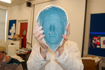
On a Friday morning a man named James Ward came to visit to demonstrate how to do make-up for horror films.

James Ward is from the National Film School of Ireland, he succeeded in passing to do model making and production design for film and television.

James got a volunteer from the class to demonstrate on. Firstly James placed a bald cap onto the volunteers' head which covered just his hair (back of head) so the mixture he was using wouldn't interfere with his hair. He used contact glue to stick the bald cap to his head. Throughout this demonstration James used polyvinyl gloves, he said not to use latex gloves as they react with the silicone's and destroy the whole mixture.

He used two types of silicones which were Life Form and Skin Safe silicone's. He measured a cup and a half of each then put them into a mixing bowl. He used his hands to mix these together to form a blue sticky mixture.

Before he done anything with the mixture he placed two plastic tubes up the volunteers' nostrils so he would be able to breathe after James had covered the whole of his face with the silicone's.

Before he began using the mixture he checked for air bubbles because it could ruin the whole mask when he goes to put the plasticine in the mould. Once he had identified he had no air bubbles he used his hands (while wearing polyvinyl gloves) to smear the silicone mixture all over his face. James waited for about 15 minutes for the mixture to set. He explained that it sets quickly so this part of the task was the hardest as once it's set you can't go back and re-correct any mistakes.

Once it had set he had small stripped bandages which he dipped in water then laid over the top of the silicone mixture on the persons face, he laid these in a criss-cross pattern so it would hold stronger. He done this until the mask was about half an inch thick. Once this had all set he asked the person to pull funny faces and puff his cheeks out so the mask would push off from his face. When James had got the mask off his face, he used a quick-release liquid over where he had put the glue before, this released the bald cap from his head.

James then plugged up the nostril holes in the mask with NSP plasticine so when he poured in the plaster inside it wouldn't leak out the nostril holes. He filled a small plastic cup with plaster and poured water into a mixing bowl. He then used his hand to sieve the plaster (powder) into the mixing bowl of water. At the beginning of this process it was a milky mixture, it then turned into an ice cream like mixture soon after. Once this was ready he poured it into the mask, which is then meant to be left for many hours to fully set. He said he usually leaves it overnight.


Tuesday 12 October 2010

Click image to view in large

My character is a 19 year old male at college. He's from a rich family and loves splashing out his money on things he likes the look of. During the weekdays he would usually get college work done on the days he doesn't work, after his hard days working hard with his dad with mechanics he'd get any rest he could in the evenings, then treat himself on a Friday or Saturday evening where he would probably go to a local restaurant such as Pizza Express with a few friends, then go to the cinema to watch a film a little bit later on. After the film he would probably head to the pub for a few drinks and a laugh with his friends before going in for the night.

I believe this type of target audience would be ideal for Blue Streak as he's into the action and thriller films, he also plays a lot of violent video games. He goes to the Cineworld regularly, if Blue Streak had a poster in the cinema I'm sure this would appeal to this audience very much.

Thursday 7 October 2010

Find Your Tribe

Go to: www.findyourtribe.co.uk

Created by Channel 4 by research agencies crowd DN4 and Voodoo.

This site invites you to complete an interactive quiz which asks you questions about your tastes on music, fashion, lifestyle, brands and media preferences.

At the end defining which 'Youth Tribe' you being to.

This is our class results:

1. Trendies
2. Hipsters
3. Craft Kids
4. Clubbers 2
5. PC world
6. Techies
7. Townies 2
8. Rahs 1
9. Chavs 1
10. Street Rats
11. Boy racers
12. Sports junkie 1
13. Blingers 1
14. Bhangra muffins
15. Trackies
16. DIYers 1
17. Get paid crew
18. Smart urban
19. Indie kids 1
20. Skaters 1
21. Monsters
22. Grungers
23. Emos
24. Goths
25. Scene Kids 1
26. Indie Scenesters


"You are a Chav! No one likes you but you don’t care. Why would you when you have a high street to hang about on? Grab a bunch of your mates and put in some mooching time, with a bucket of KFC for company. With your matching uniform of trackie pants, Reebok Classics, and gold jewellery, chav isn’t something you grow out of: this is your tribe forever."


I don't think the outcome 'chav' is an accurate representation of me because I don't wear 'chav' style; reebok etc, hats, gold chains and rings. I don't hang out on the streets "protecting my turf" either. They describe a 'chav' as violent, I don't believe I am a violent person. I think most chavs listen to grime, which I selected on the quiz that I hate grime.

Sunday 26 September 2010

Logo Homework


L2 IDENT LEE from cmdiploma on Vimeo.

The toughest situation I came across while working in Photoshop during the logo creation was the layers, by this I mean they got very confusing for me, especially when it came to saving each individual layer then transferring it over to Final Cut, how was I meant to know which layer was which?

I realised this problem when I went to save each layer. I resolved this dilemma by going over each layer to identify what it was, then re-naming the layer so it was clear what the layer is.

During this task working in Final Cut, the most difficult part of it was when I realised my logo clip was too long and dragged on. I had added fade in/outs at the beginning and end, therefore I had to shorten my clips which would then make me lose the fade in/outs, I proceeded with this. Later on when I tried to re-add the fade ins the original ones were still there, but I couldn't see them as I had shortened the clip, which were interfeiring with my whole logo.

I realised this after a while, which I had to then make the clip large so I could see the original fade in, delete it then shorten the clip and re-add the fade ins. From this problem I believe it has been good practice for me adding and removing fade in/outs, I have leant to work with these particular parts well I would say.

Overall with this logo I am most pleased with the main part of it, which was my explosion, visual and my audio which has good timing. The layers come out at you with the sound of a bomb going off. The good timing makes the whole thing look more proffessional, if it was badly out of time, it would be very boring and unproffessional.

Visual


Vincent Willem van Gogh

  • Died at the age of 37 (29th July 1860)
  • Produced more than 2000 pieces of artwork
  • Born 30th March 1853
  • He was Dutch
He was a very famous artist. His fame grew large after his death. According to research he had suffered from depression and there was bipolar to his history, they believe in the last 2 years of his life he had temporal lobe epilepsy. He commit suicide at the age of 37, he shot himself somewhere in the chest, he then died 2 days later.

The purpose of Van Gogh's work is hard to say. It could have been to entertain people which it did, however it could have just been a way for him to express his feelings which in a lot of his artwork he succeeded to do, he may have only done it because he enjoyed it too.

There are many ways to see his artwork, you could access pictures of his artwork from Google images and various other websites and online galleries. He also has a museum located in Amsterdam, Netherlands. His artwork is extremely expensive, they could well be some of the worlds most expensive artwork. According to Wikipedia, one of his paintings from 1948 was sold at an auction for US$140 million in 2006.

Print


Books

Books have a wide range of purposes including entertainment, to inform, to advertise and many more.

According to Wikipedia they say "In 2010, Google estimated that there were approximately 130 million unique books in the world."

The first book was written many thousands of years ago, so long ago it's hard to know at this stage. It's also hard to say who wrote the first book too, many people would argue it was "God" who wrote the bible, which was the first book. Many would disagree with this also due to religious views.

There are books about literally anything and everything. There is a very large range of genres; horror, comedy, action and many many more!

Thursday 23 September 2010

Advertising Media Product


Google


History of Google
  • Founded by Larry Page and Sergey Brin (University students in California at the time).
  • Google began in January 2006.
  • Originally google.stanford.edu.
  • Obtained the domain google.com on the 15th September 1997.
  • Google and Yahoo have always been competitors
The purpose of Google originally was so people can find what they want with ease by using the Search Engine. They now have released many other things such as Google Chrome, Gmail, Google Earth, instant messaging and many more applications, they have a wide range of purposes now such as advertising, to inform people, to educate people and also to help people by providing maps.

Wednesday 22 September 2010

Electronic Media Product


Click the image to be forwarded to the official playstation website.


Playstation 3


General information
  • Playstation 3 is a games console produced by Sony Entertainment.
  • It was released on March 16th 2007 in the UK.
  • The Playstation 3 is in the 7th generation era of Sony Computer Entertainment consoles.
  • Playstation/Sony Entertainment are in competition with Xbox/Microsoft.
  • Sony Entertainment have successfully released previous games consoles such as: Playstation, Playstation 2 (including Playstation 1 slim & Playstation 2 slim), PSP and more!

Features

  • Online feature (play games online with friends & people over the World).
  • Between 20-320GB (depending on the model you buy).
  • Range of different controller types.
  • Various colours for the games console.
  • Certain games that are pacifically for Playstation 3 only.
  • Includes Wi-Fi, Flash Memory Card, USB Ports and Linux support (depending on the type of model you buy).


Audio/Visual


Snatch


Snatch is directed and written by Guy Ritchie, who also wrote and directed Lock, Stock and Two Smoking Barrels.
This film was released 1st September 2000.
This also recieved 4 wins & 5 nominations.
Staring famous actors: Brad Pitt, Jason Statham, Vinnie Jones, Jason Flemyng and more!


Target audience
  • People who enjoy action films.
  • People that enjoyed Lock, Stock and Two Smoking Barrels.
  • People who like humourous films.
  • People that are into gangster films; crime, drugs & violence
Purpose

The purpose of this film is to entertain the audience like any other film.

Audio


Click the image to be forwarded to kiss 100

History of Kiss 100

  • The original owner of Kiss is Gordon Mac
  • Kiss began in October 1985
  • When Kiss began it was a pirate radio station.
  • It was licensed in 1990.
  • It began by broadcasting over South London.
Purpose of Kiss 100

  • To entertain people.
  • To inform people about new music and what's going on with artists.
  • To put talented people out there to be heard.
Target audience of Kiss 100

  • People interested in music.
  • People interested in particular artists.
  • People who listen to the radio.


POST 1